
Quality design and code
WCAG accessibility standards
Light and dark themes
UX best practices
Dev Mode is the foundation
Every component and its variations come hand-in-hand with a dedicated story in Storybook. Each prop is meticulously matched in terminology to React, and correlated props are clearly marked.
This lets designers and developers speak the same language, clearing up any confusion and keeping everyone on the same page. With common terms and practices, product teams can speed up their work, making Functional UI Kit your go-to for smooth teamwork.
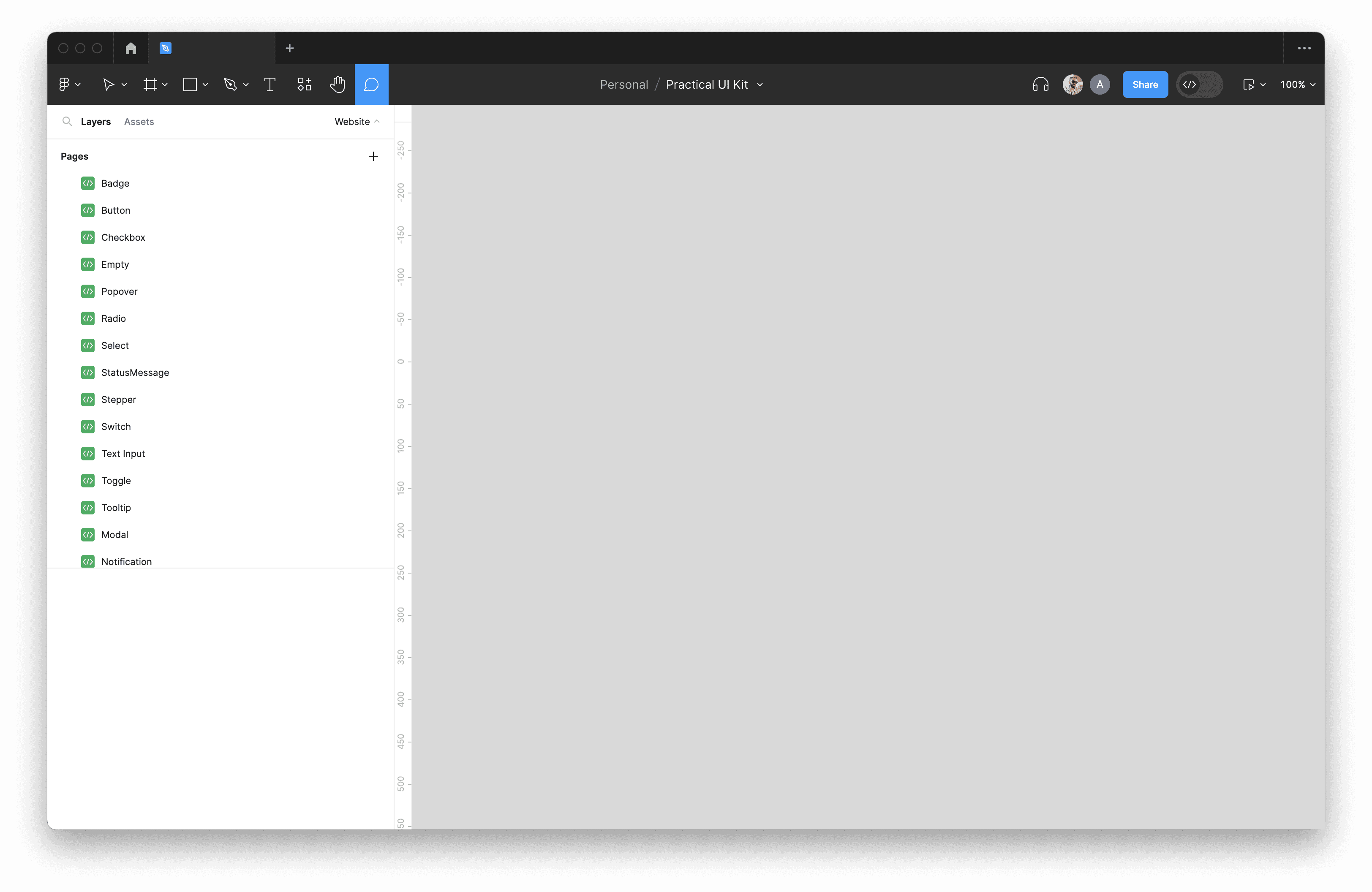
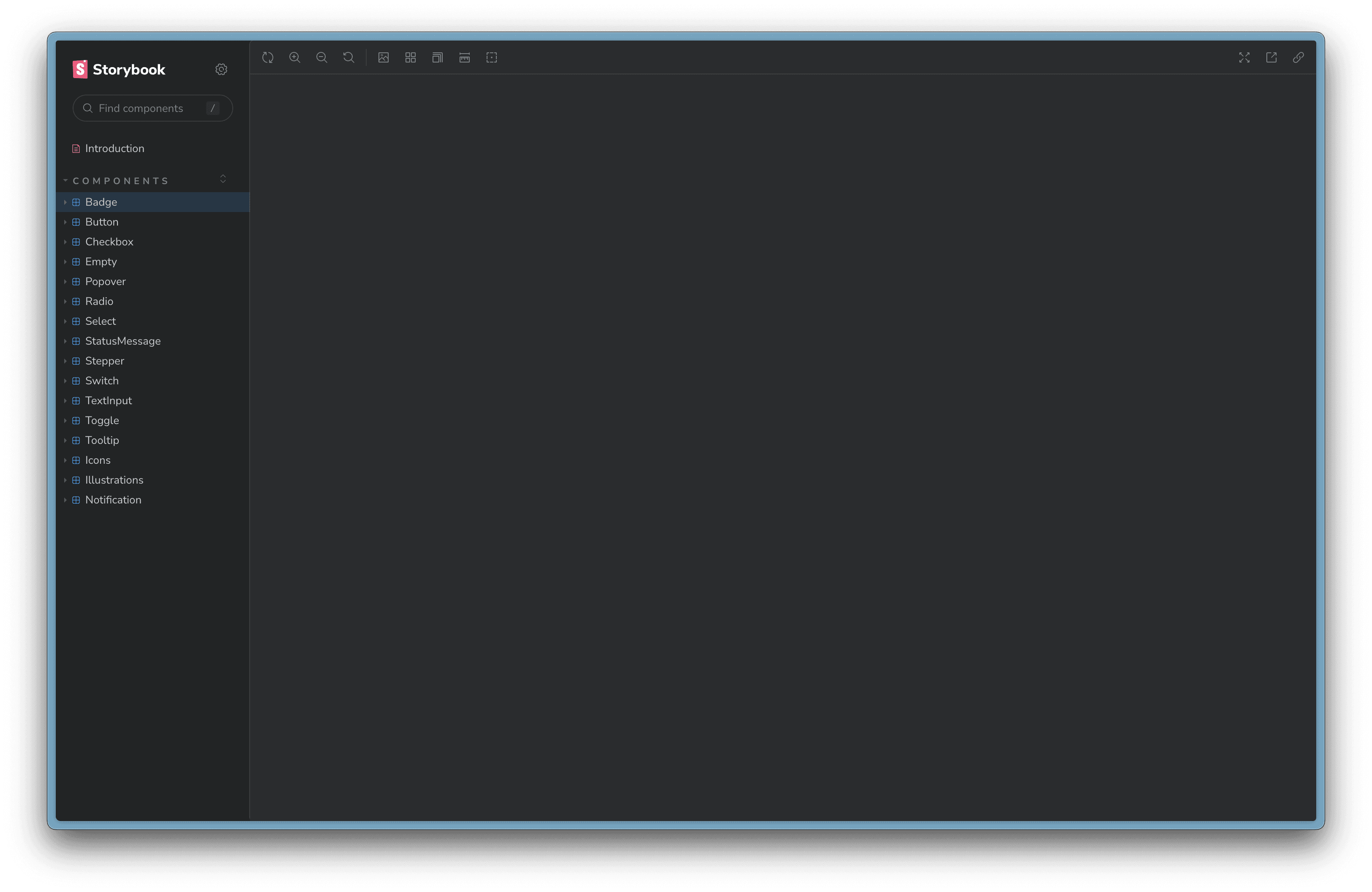
Figma
CSS
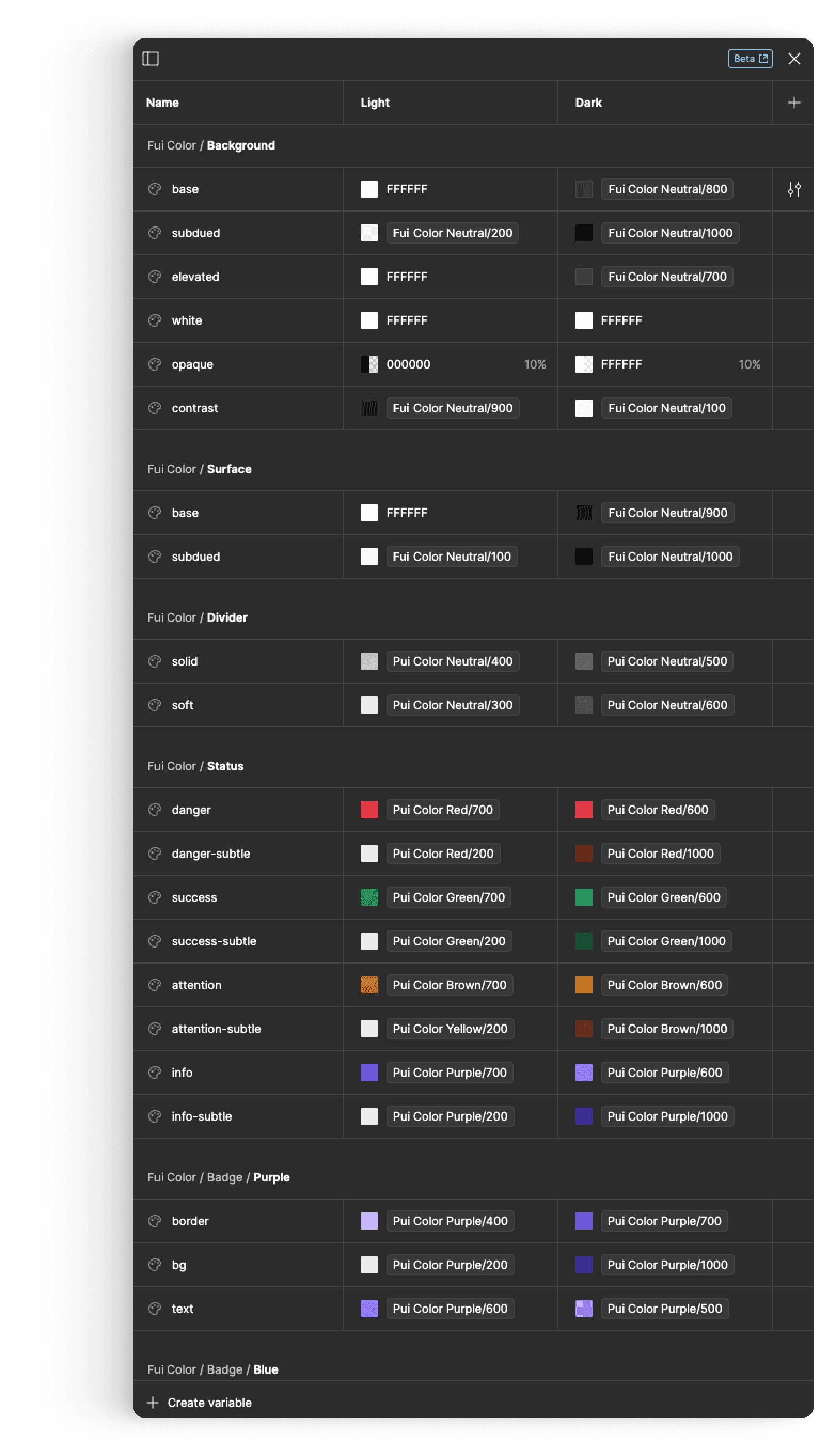
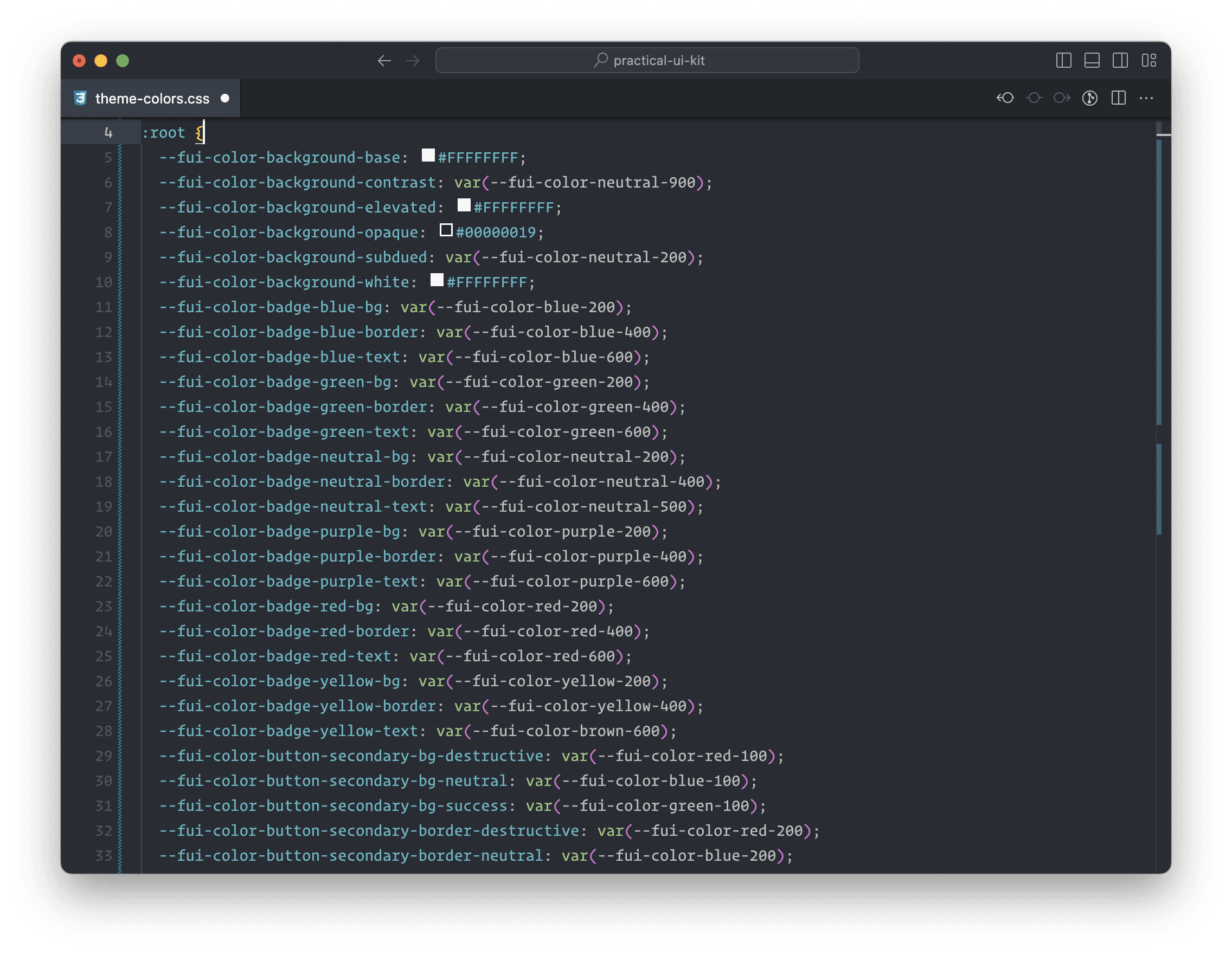
We've made sure that Figma variables and CSS variables work together effortlessly. They share the same names, usage and inheritance structure. This isn't just an extra feature; it's the core approach.
Each Figma variable has a direct counterpart in CSS, so there's no confusion. Your design ideas stay crystal clear as you move into the development phase.
Accessible Best Practices
Our kit covers all the fundamental components you need, available in both light and dark modes. These components are designed with precision and adhere to WCAG accessibility guidelines.
Every component is crafted with a deep understanding of UX principles and best practices. Colors and sizes are chosen with accessibility in mind. You can be confident that your designs will not only be visually appealing but also usable by a wide range of users.
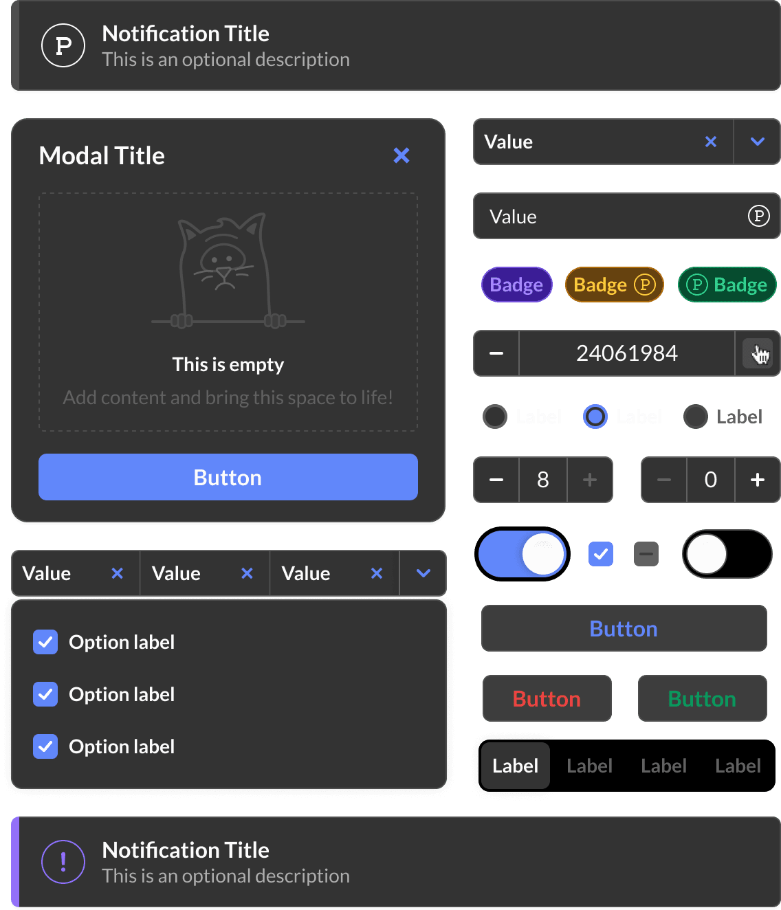
Style collision damage waiver
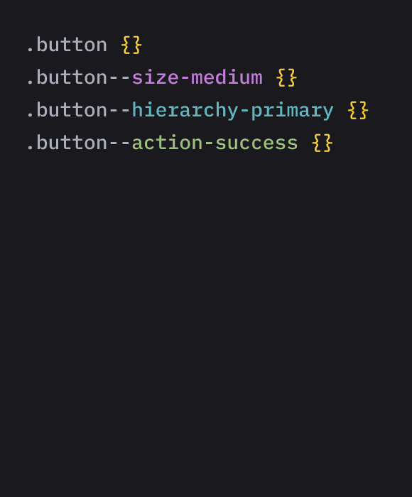


Style side effects that can drive teams crazy. Our CSS architecture shields you from these pesky inconsistencies. Intentional overrides are welcomed but side-effects are not.
Correlated type system
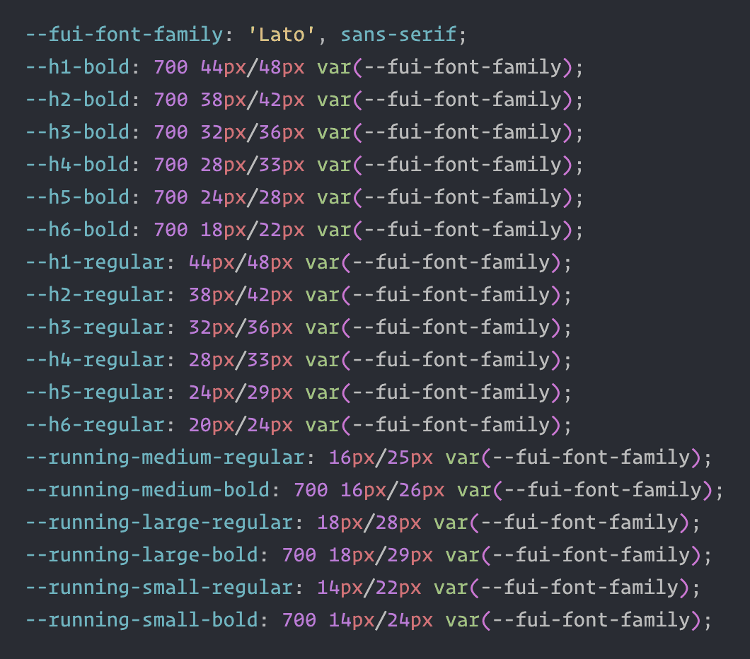
Your fonts, line heights and letter spacings stay the same whether you're designing or coding. Wave goodbye to typographic inconsistencies between design and code.
Auto Layout is mirroring the same box model structure in CSS using best practices & ensuring reliability.
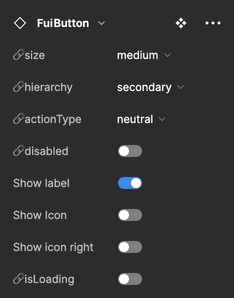
Copy-paste props with zero to none code naming adjustments.
FREE
$0
p/month
Quality design and code
Unified api between design and code
Consistent components
WCAG accessibility standards
Minimise style side effects
Light and Dark Modes
Minimum dependencies
Figma Annotations
Copy-paste simplicity
Responsive components
Customizable theme
Built by experienced designers & developers
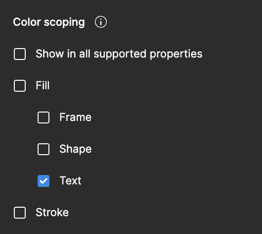
Scoped color system
Typographic harmony
New auto layout features
Min/max size features
Shape & size unit variables
What is Functional UI Kit?
How does Functional UI Kit maintain consistency between design and code?
Is Functional UI Kit free to use?
What sets Functional UI Kit apart from other design systems?
Do I need a developer to start using this kit?
Do I need a designer to use this kit?


